Analytics charts are frequently used to compare metrics over different timelines. However, you may be interested in comparing the two or more metrics in a single dashboard. This ability helps the BizTalk360 users to compare data to understand potential correlation between the different metrics across the stack.
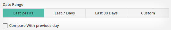
Compare Data from Different Date Range
You have the options to select a date range for comparing performance counters for a time-series analysis. Compare the data with a previous day/week/month data for more analysis.
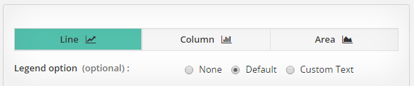
Choosing the Best Chart Type
By default, BizTalk360 provides you options to choose the best chart type for the conclusions you want to present. A chart can be easily changed to another chart type any time at a click of a button.
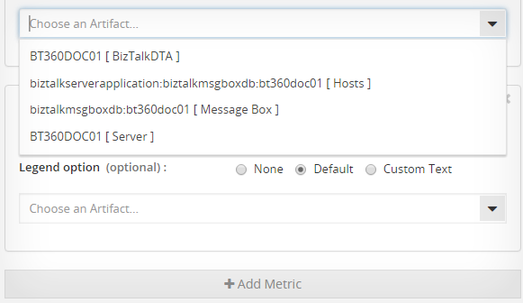
Adding a New Metric
Sometimes it’s difficult to get a thorough picture of your performance with a single metric. With custom widgets, you can compare multiple metrics over wide date range and different graph options.